I still remember the day my partner and I decided to tackle the living room in our quirky old house. We wanted to create a space that felt like us, but we were stuck on the first hurdle: how to choose a color palette. Everyone says it’s all about finding a theme or a style, but I think that’s a myth. The truth is, choosing a color palette is about telling your story, and that’s a much more exciting – and daunting – task.
As you embark on your own journey to find the perfect colors, I want to assure you that this article will be your guide to unleashing your personal style. You won’t find any generic color wheels or trendy palettes here. Instead, I’ll share my own experiences, tips, and tricks for creating a color palette that reflects your unique personality and makes your home feel truly yours. From scouting inspiration to testing out samples, I’ll walk you through the process of how to choose a color palette that will bring your space to life and make it a reflection of your story.
Table of Contents
Guide Overview: What You'll Need

Total Time: 1 hour 15 minutes
Estimated Cost: $0 – $20
Difficulty Level: Easy
Tools Required
- Computer or Mobile Device (with internet access)
- Color Wheel Printout (optional)
- Paint Swatches (optional)
Supplies & Materials
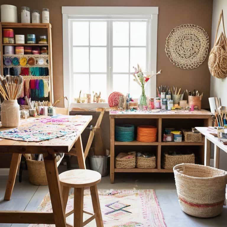
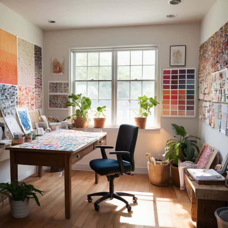
- Color Palette Inspiration Materials (e.g., photos, fabrics, objects)
- Notebook or Journal (for recording color combinations)
Step-by-Step Instructions
- 1. First, let’s start by gathering inspiration from the things that make you happy – it could be a favorite piece of artwork, a vibrant rug, or even a beautiful sunset. Take photos of these inspirations and create a mood board, either physically or digitally, to visualize the colors and tones that resonate with you. This will be the foundation of your color palette, helping you to identify the hues that feel like home to you.
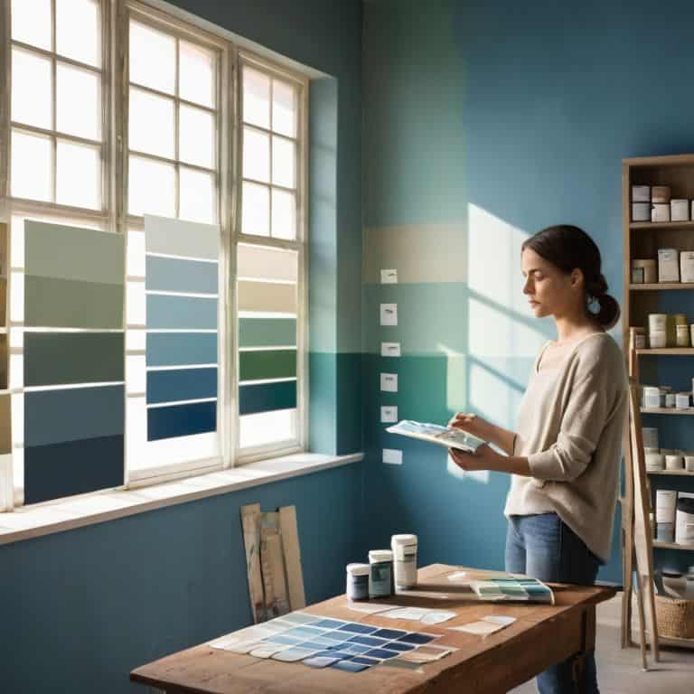
- 2. Next, consider the natural light in your space – how it changes throughout the day and how it affects the colors you’ve chosen. Take note of the time of day when the light is most pleasing to you, and think about how you can enhance or complement it with your color palette. This will help you to create a harmonious balance between the natural and artificial light sources in your home.
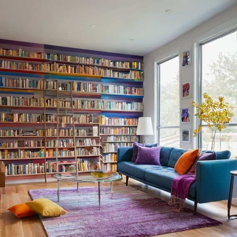
- 3. Now, let’s talk about the 60-30-10 rule – a simple guideline to help you balance your color palette. Allocate 60% of your space to a dominant color, 30% to a secondary color, and 10% to an accent color. This will create a sense of visual flow and prevent your space from feeling overwhelming or chaotic. Remember, this is just a guideline – feel free to experiment and adjust the proportions to suit your personal style.
- 4. It’s time to get hands-on and start playing with color combinations. Use paint swatches, color cards, or even digital tools to explore different palettes and see how they work together. Don’t be afraid to mix and match different colors, textures, and patterns to create a unique look that reflects your personality. Take photos of your experiments and compare them to your mood board to see what works best.
- 5. As you narrow down your color options, consider the emotional impact of each hue. Think about how different colors make you feel – do you find calmness in soft blues and greens, or energy in vibrant oranges and yellows? Choose colors that evoke the emotions you want to experience in your home, and remember that it’s okay to trust your instincts – after all, this is your story, and you get to write the happy ending.
- 6. With your color palette starting to take shape, it’s essential to test the colors in your actual space. Paint a small sample area on the wall, or use a paint simulator app to see how the colors will look in different lighting conditions. This will give you a more accurate representation of how the colors will interact with each other and with the natural light in your home.
- 7. Finally, don’t forget to have fun and be flexible – choosing a color palette is a process, and it’s okay to make adjustments along the way. Remember, this is a creative journey, and the most important thing is to enjoy the ride and learn as you go. Take your time, stay true to your vision, and you’ll be well on your way to creating a color palette that tells your unique story and makes your home a reflection of your personality.
Weaving Your Homes Tale
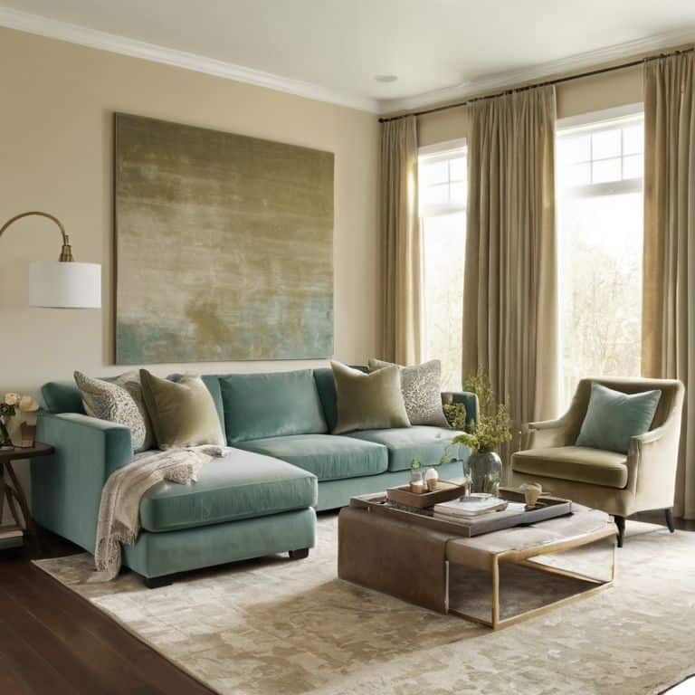
As I delve into the world of colors, I find myself drawn to the concept of color harmony principles. It’s amazing how certain hues can come together to create a sense of balance and tranquility in a room. I like to think of it as _weaving a tapestry_ of colors that tell a story. When selecting a color palette, consider the 60-30-10 rule: 60% of the room should be a dominant color, 30% a secondary color, and 10% an accent color. This principle helps create a sense of _visual flow_ and makes the space feel more cohesive.
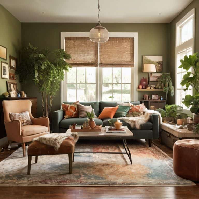
When exploring interior design color schemes, I often find inspiration in nature. The way the sunlight filters through the leaves in my urban garden or the vibrant colors of a flea market find can spark a new idea. I also love experimenting with monochromatic color palette ideas, where different shades of the same color create a sense of depth and unity. This approach can be particularly effective in small spaces, where a limited color palette can make the room feel larger.
As I create a mood board for color inspiration, I consider the _emotional impact_ of each hue. Color psychology in decorating plays a significant role in setting the tone for a room. For example, analogous color palette examples, where colors are next to each other on the color wheel, can create a sense of calmness and serenity. By thoughtfully selecting colors that reflect my personality and style, I can craft a space that feels truly authentic and inviting.
Color Harmony Principles Unlocked
Now that we’ve started weaving our home’s tale, let’s unlock the secrets of color harmony. I like to think of it as creating a symphony of hues that dance together in perfect rhythm. For me, it’s all about finding that magical balance between colors that might seem unrelated at first, but ultimately tell a cohesive story. My power tool, Bertha the brush, and I have had our fair share of color experiments – some successful, others not so much! But that’s all part of the fun, right?
As I delve into the world of color harmony, I’m reminded of my urban gardening adventures. Just as the right combination of plants can create a thriving ecosystem, the right color palette can bring a room to life. I’ve found that understanding the 60-30-10 rule – where 60% of the room is a dominant color, 30% a secondary color, and 10% an accent color – has been a game-changer in my own design journey. It’s amazing how this simple principle can help create a sense of flow and visual interest in a space.
Mood Board Magic for Inspiration
Now that we’ve unlocked the secrets of color harmony, let’s dive into the fun part – mood boards! I love creating mine by cutting out images from magazines, adding swatches of fabric, and including notes about the feelings I want to evoke in each room. It’s amazing how a vision board can help you visualize your space’s story. I like to think of it as a treasure map to your dream home. Gather items that inspire you, from nature walks to favorite artwork, and start arranging them in a way that feels like your perfect sanctuary. This is where the magic happens, and your unique style starts to shine through!
Unraveling the Rainbow: 5 Treasure Tips to Choose a Color Palette that Tells Your Story
- Let your personality shine: think about the emotions you want to evoke in each room and pick colors that resonate with your inner world
- Play detective: scour your favorite books, nature, and art for color combos that spark joy and inspiration – it’s all about finding what feels like you
- Get your hands dirty: test out samples on your walls, and don’t be afraid to mix and match – it’s all part of the adventure
- Consider the 60-30-10 rule: 60% of your room should be a dominant color, 30% a secondary color, and 10% an accent color – but remember, rules are meant to be broken
- Step into the story: imagine the colors you’ve chosen as characters in your home’s narrative – do they work together in harmony, or is it time to rewrite the script
Your Color Palette Story in 3 Acts
Let your personality shine by choosing colors that reflect your story, rather than following the latest trends – after all, your home should be a reflection of you!
Experiment with mood boards and color harmony principles to unlock the perfect palette that brings your unique tale to life, and don’t be afraid to think outside the box
Remember, your color palette is just the beginning – it’s a thread that weaves your entire home’s narrative together, so have fun and get creative with the process of turning your house into a home that tells your story
The Heart of Home Storytelling
Choosing a color palette is not just about picking hues, it’s about setting the tone for the story your home tells – every brushstroke, every swatch, and every shade is a word in the narrative of your life.
Maya Rivera
Bringing Your Color Story to Life
As we wrap up our journey to choose the perfect color palette, let’s recap the essentials: we’ve learned how to unlock color harmony principles, harness the magic of mood boards for inspiration, and weave our home’s unique tale through a thoughtful selection of hues. By embracing these steps, you’ve taken a significant leap towards transforming your space into a reflection of your personality and style. Remember, the goal is to create a home that tells your story, not just a beautiful space. So, don’t be afraid to experiment and make those colors truly yours.
Now, as you stand in your home, surrounded by the colors that resonate with your soul, I hope you feel an overwhelming sense of pride and accomplishment. Your space is no longer just a collection of walls and furniture; it’s a living, breathing narrative that echoes your personality, values, and dreams. So, go ahead, take a deep breath, and let the beauty of your creation inspire you to continue writing the next chapter in your home’s story, and the next, and the next.
Frequently Asked Questions
How do I balance my personal color preferences with the natural lighting in my home to create a harmonious palette?
Ah, the sweet spot where personal style meets natural light! To balance your faves with the sun’s glow, observe how light changes throughout the day in each room. Take note of the hues it brings out in your space, and blend those with your go-to colors. My trusty sidekick, a color wheel named ‘Chroma,’ helps me find harmonious combos – give it a try!
What role do neutral colors play in a color palette, and how can I use them to add depth without overwhelming the space?
Neutrals are like the quiet heroes of color palettes – they add depth without stealing the show. I like to think of them as the “breathing room” in a space. Use them to balance out bolder hues and create a sense of calm, but don’t be afraid to add texture and pattern to keep things interesting!
Can I use a favorite piece of artwork, rug, or furniture as inspiration for my color palette, and if so, how do I extract the key colors from it?
Absolutely, use that favorite piece as a color catalyst! Take a closer look, snap a photo, and extract the key hues using a color picker tool or by matching colors with paint swatches – it’s like uncovering a treasure trove of inspiration, and I just love it!